Movie Night for UOP Data Science Masters Students
The objective of this report is to create a recommendation engine that can cluster students based on their preferences in Action, Adventure, and Thriller movies.

Objective
As the pandemic prompted many universities to transition to remote learning, administrators and campus instructors were unsure on how students would remain connected during these uncertain times. For the Data Science Master’s Program at the University of the Pacific, the transition posed a great challenge since alternating Saturday in-person instruction was the only opportunity for students to collaborate face to face. To maintain a sense of community, the Program Directors want to organize a virtual movie night for the students.
To help the Directors understand their students’ preferences, I aim to create a recommendation engine that can cluster students based on their preferences in Action, Adventure, and Thriller movies so that the Directors can select movies that appeal to their students’ tastes. Additionally, the recommendation engine would also help make predictions on new students based on the model created. This would enable the Directors to place a new student with a cluster of students that share similar interests.
Data Exploration
Cocktail
Before conducting any exploratory data analysis, I imported the required libraries, as well as set some pandas options.
# Preparation for pandas
import pandas as pd
import numpy as np
import matplotlib.pyplot as plt
from matplotlib.pyplot import figure
from scipy.cluster.hierarchy import linkage, dendrogram
import plotly.graph_objects as go
from sklearn.cluster import KMeans
from sklearn.neighbors import KNeighborsClassifier

# Set some pandas options
pd.set_option('display.notebook_repr_html', False)
pd.set_option('display.max_columns', 30)
pd.set_option('display.max_rows', 30)
Read in the Data
To begin my EDA, I used pd.read_csv() to read the CSV file containing the survey responses, as well as printed the records of the first respondent. From the print out, we can see that the column names are listed to the left, while the response data is listed to the right.
# Read csv file and print records of first respondent
survey = pd.read_csv('MoviesSurvey2020.csv')
survey.iloc[0]
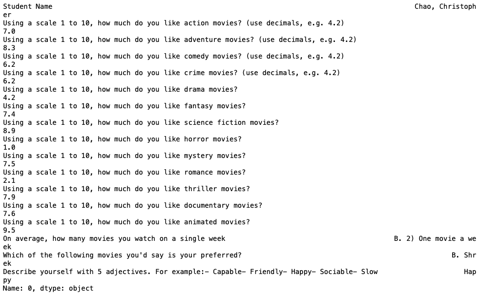 First record of the dataset
To make things easier for the clustering algorithms, I decided to set the first column, Student Name, as the index.
survey = survey.set_index('Student Name')
Using .index, I verified that the index was set to Student Name.
# Retrive index
survey.index
 Index
Index
I also wanted to know how much data I was working with. With the succeeding code, I learned that 40 participants responded to 16 questions, excluding the Student Name field. Our cohort is currently composed of 33 participants, including the professor. From the preceding print out, I noticed that the dataframe includes students that have dropped the program. This means I’ll have to do some data cleaning on those rows in the following sections.
# Retrieve the dimensions
print("There are " + str(survey.shape[0]) + " rows and " + str(survey.shape[1]) + " columns in this table.")
 Dataset dimensions
With .dtypes, I retrieved the data types of each column. All but 3 contain floats. The 3 remaining columns are of type object, which can also be identified as strings.
survey.dtypes
 Data Types
Using .describe(), I can view a statistical summary of each numeric column. Additionally, I can verify that the responses were within range by looking at the min and max of each column. All numeric responses were below the threshold of 10. Four columns, however, contain responses below the threshold of 1, but above 0. To make things easier, I decided to expand the threshold from between 1 and 10 to between 0 and 10.
survey.describe()
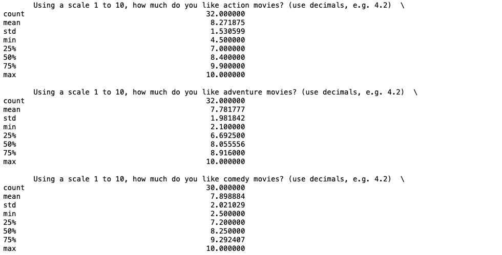 Summary statistics
Data Cleaning
As mentioned earlier, I expected my dataframe to contain missing values. To verify, I ran the following code to retrieve a total sum of missing values per column. We can see that every single one of the columns contain missing values.
survey.iloc[:,:].isnull().sum()
 Missing values
I did not want to lose too much data by removing the rows that contained missing values. Instead, I decided to fill the missing values of the numeric columns with the mean of its corresponding column. This seemed like the most reasonable place holder because it would not significantly affect our clustering.
for i in range(0,13):
    survey.iloc[:,i].fillna(survey.iloc[:,i].mean(), inplace=True)
Running the same code as earlier, we can now see that none of the numeric columns contain any missing values.
survey.iloc[:,:].isnull().sum()
 Missing values
Dendrogram
I decided that I wanted to cluster my participants based on their interest in Action, Adventure, and Thriller movies. To capture these responses, I created another subset with just those 3 columns.
subset = survey.iloc[:,[0,1,10]]
To verify, I used .columns on my new subset.
subset.columns
 Columns
Since my subset is 3-dimensional, I made a 3D scatter plot so I could visualize all my data points. This scatter plot also enables users to hover over each data point to retrieve the response values, as well as the Student Name.
fig = go.Figure(data=[go.Scatter3d(x=subset.iloc[:,0], y=subset.iloc[:,1], z=subset.iloc[:,2], mode='markers',
                                   text=subset.index)])

fig.update_layout(scene = dict(
    xaxis_title="Action",
    yaxis_title="Adventure",
    zaxis_title="Thriller"),
    width=1000,
    margin=dict(r=30, b=10, l=10, t=10))

fig.show()
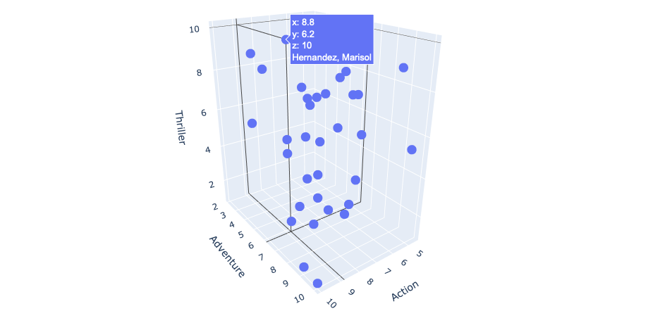 3D scatter plot
Though I could determine the k number of clusters from just my plot above, I decided to make a dendrogram that allocates participants into clusters. From the color scheme below, I can determine that the participants are allocated into 3 clusters.
figure(figsize=(10, 10))
D = dendrogram(linkage(subset, 'average'), orientation="right", leaf_font_size=11, labels = subset.index)
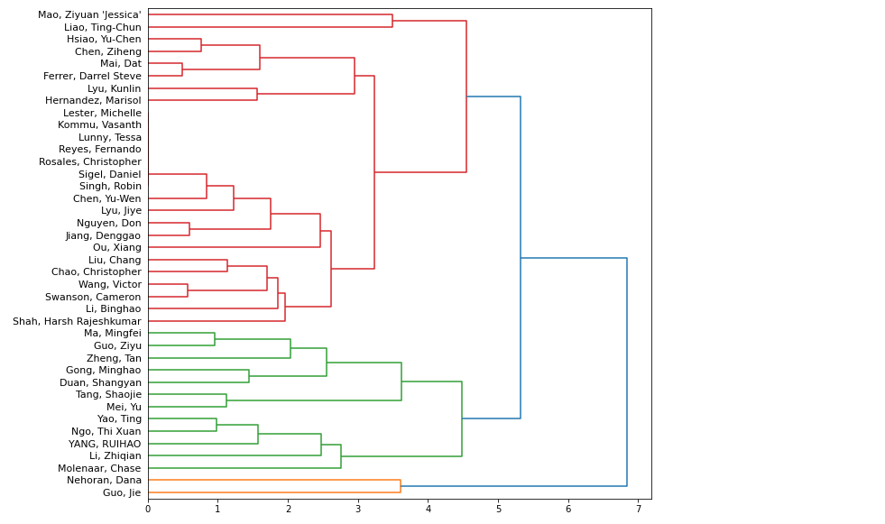 Dendrogram
Step-by-step K-means
Random Centroids
The next step was to establish random centroids according to the k I determined in the previous section. To begin, I created a copy of my subset.
first = subset.copy()
Since I determined k = 3, I created and added 3 random centroids to my dataframe.
first.loc['Centroid 1'] = [7, 1, 5]
first.loc['Centroid 2'] = [6, 9, 3]
first.loc['Centroid 3'] = [9, 5.5, 8]
Before I could create another 3D scatter plot, I created an array c that specifies the colors of each of my data points. Below, you can see that I chose all 40 of my original data points to be grey and each of my centroids a different color.
c = np.concatenate((np.repeat("grey", 40), np.array(["navy","yellow","red"])))
Plotting the data of my new copy, we can now see where each of my centroids lie.
fig = go.Figure(data=[go.Scatter3d(x=first.iloc[:,0], y=first.iloc[:,1], z=first.iloc[:,2], mode='markers',
                marker=dict(color=c, size=np.concatenate((np.repeat(17,40), np.array([30,30,30])))), text=first.index)])

fig.update_layout(scene = dict(
    xaxis_title="Action",
    yaxis_title="Adventure",
    zaxis_title="Thriller"),
    width=1000,
    margin=dict(r=30, b=10, l=10, t=10))

fig.show()
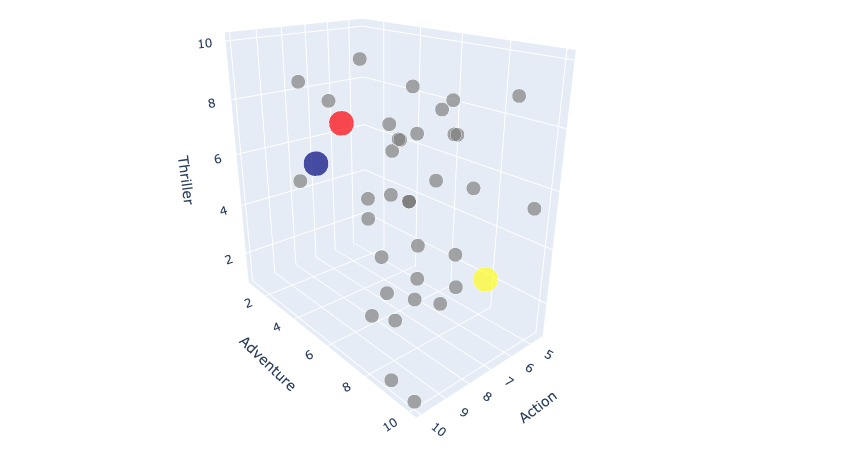 3D scatter plot with centroids
Clustering Algorithm
I wanted to create a function called kmeans() which accepts a dataframe df and k clusters as parameters, and returns the clusters created. I wanted to take a step further and build a function that creates clusters manually without any external libraries. The function performs the following:
- Establishes
krandom centroids. - Creates an
Associationcolumn. - Calculates the distance between each point and each centroid.
- Finds the minimum distance and associates the point with the corresponding centroid.
- Recenters the centroids.
- Allocates the association of each centroid.
- Plots the clusters.
def kmeans(df,k):
    test = df.copy()

    for i in range(1,k+1):
        test.loc['Centroid '+str(i)] =  np.random.randint(0,11,3)

    test["Association"] = ""

    j = 1

    while j < 50:
        for i in range(1,k+1):
            test[str(i)] = np.sqrt((test.iloc[:,0] - test.loc['Centroid '+str(i)][0])**2
                                   + (test.iloc[:,1] - test.loc['Centroid '+str(i)][1])**2
                                   + (test.iloc[:,2] - test.loc['Centroid '+str(i)][2])**2)

        test["Association"] = pd.to_numeric(test.iloc[:,4:].idxmin(axis = 1))

        for i in range(1,k+1):
            test.loc['Centroid '+str(i)] = test[test.Association == i].iloc[0:39,0:3].mean()

        for i in range(1, k+1):
            test.loc['Centroid '+str(i)]["Association"] = i

        j = j + 1

    fig = go.Figure(data=[go.Scatter3d(x=test.iloc[:,0], y=test.iloc[:,1], z=test.iloc[:,2], mode='markers',
                          marker=dict(color=test["Association"], size=np.concatenate((np.repeat(17,40),
                          np.repeat(35,k)))), text=test.index)])

    fig.update_layout(scene = dict(
        xaxis_title="Action",
        yaxis_title="Adventure",
        zaxis_title="Thriller"),
                      width=1000,
                      margin=dict(r=30, b=10, l=10, t=10))
    fig.show()
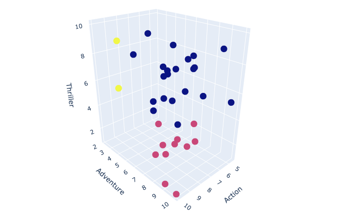
Running the function on the subset dataframe and specifying k = 3 returns the following clusters.
kmeans(subset,3)
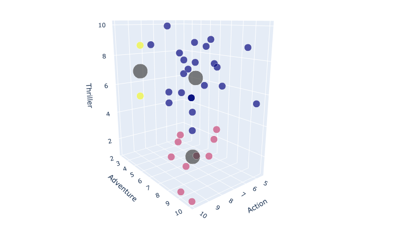 3D scatter plot with recentered centroids
sklearn.cluster
Again, I want to run unsupervised k-means clusters, but this but this time using the sklearn.cluster library. The library consists of a function called KMeans() where we can specify the number of clusters with the n_clusters parameter as seen below. In this case, I ran the function so that it creates 3 clusters on my subset dataframe.
# K Means Cluster
model = KMeans(n_clusters = 3)
model.fit(subset)
Using the .labels_ method on our model retrieves an array of the associated clusters.
model.labels_
 Labels
Plotting Clusters with k = 3
Now I was able to plot my 3 clusters by defining the color of my points to equal model.labels_.
fig = go.Figure(data=[go.Scatter3d(x=subset.iloc[:,0], y=subset.iloc[:,1], z=subset.iloc[:,2], mode='markers',
                                   marker=dict(color=model.labels_), text=subset.index)])

fig.update_layout(scene = dict(
    xaxis_title="Action",
    yaxis_title="Adventure",
    zaxis_title="Thriller"),
    width=1000,
    margin=dict(r=30, b=10, l=10, t=10))

fig.show()
 3D scatter plot
Prediction
Lastly, I wanted to create a function called predictKNN that takes 3 parameters, which represent a score for each of genre, Action, Adventure, and Thriller, and returns a prediction for the cluster the student belongs to.
def predictKNN(action, adventure, thriller):
    knn = KNeighborsClassifier(n_neighbors = 5, p = 2)
    knn.fit(subset, model.labels_)

    cluster = knn.predict(np.array([action, adventure, thriller]).reshape(1, -1))[0]
    color = ["Blue", "Pink", "Yellow"]
    print('Action Score:', action, '\nAdventure Score:', adventure, '\nThriller Score:', thriller,
          '\nPrediction: Cluster #', cluster, color[cluster])
I ran the function 10 times with different parameters. Each run returned accurate predictions.
# 1
predictKNN(9,8,3)
 Prediction 1
# 2
predictKNN(10,10,5)
 Prediction 2
# 3
predictKNN(9,8,8)
 Prediction 3
# 4
predictKNN(2,6,7)
 Prediction 4
# 5
predictKNN(3,1,1)
 Prediction 5
# 6
predictKNN(10,10,10)
 Prediction 6
# 7
predictKNN(3,8,2)
 Prediction 7
# 8
predictKNN(8.3,1.7,5.6)
 Prediction 8
# 9
predictKNN(4.3,2.7,6.6)
 Prediction 9
# 10
predictKNN(2.9,7.8,2.2)
 Prediction 10
Summary
When hosting a virtual movie night for the students of the Data Science Program, the Directors might want to better understand their students’ preferences. One method they could use is clustering, a method of grouping objects in a way where the objects in the same group are more similar than objects in other groups. In this case, clustering groups students that share similar preferences into the same cluster. This can help the Directors understand their students’ preferences a lot better so that they can choose a movie that better suits their interests.
In my cluster analysis, I decided to cluster students based on their interests in Action, Adventure and Thriller movies. With these 3 attributes, I created a dendrogram to help determine the number of clusters I have. Based on the color scheme, I determine my data was composed of 3 clusters. Next, I established 3 random centroids with my data in a 3D scatter plot. I then created a clustering function called kmeans() that takes in a dataframe and k as parameters and returns the clusters created. In this plot, I could see the difference in placement of my centroids.
To verify my clusters, I ran another unsupervised k-means clusters using the sklearn.cluster library. There were a few difference in the clusters created by my own algorithm and the library itself, but nothing too drastic. If anything, the sklearn.cluster library provides greater accuracy. Lastly, I created a function called predictKNN() that makes a prediction for the cluster a student belongs to based on their preferences.
My analysis can bring tremendous support when organizing a movie night for the Data Science students because it provides a better understanding of the students’ preferences. The Directors could use the clusters created to perhaps design a series a movie nights where they choose a movie that appeals to each cluster. Additionally, they can use my recommendation engine to classify any new students based on their interests.
The source code is available here.
