Clustering U.S. Universities
The objective of this study is to cluster U.S. universities into groups with similar accepted SAT component scores and use these to give recommendations of colleges to high school seniors.

Objective
For high school seniors, the process of choosing where to apply can be quite daunting – many factors such as school size, location, culture, and available majors come into play, to say nothing of required test scores and GPA. In light of this, the San Francisco County Office of Education has come to us for assistance in finding ways to make this decision easier for prospective applicants.
To this end, we’ve found a dataset of all U.S. universities, which contains various statistics from the 2013-14 application period, including location, undergraduate enrollment, tuition, standardized test scores, and graduation rate. Our goal is to use this information to cluster these universities into groups with similar accepted SAT component scores, so as to give more in-depth recommendations of colleges to high school seniors.
In addition to the information already in our dataset, we will also calculate the total SAT score and total graduating students of each university to assist in our research.
Data Exploration
Cocktail
Before conducting any exploratory data analysis, I imported the required libraries, as well as set some pandas options.
# Import libraries
import numpy as np
import pandas as pd
from pandas import DataFrame, Series
import matplotlib.pyplot as plt
import seaborn as sns
import plotly.graph_objects as go
import plotly.express as px
from sklearn.cluster import KMeans
from sklearn.neighbors import KNeighborsClassifier
from matplotlib.pyplot import figure
from scipy.cluster.hierarchy import linkage, dendrogram
from sklearn.metrics.pairwise import euclidean_distances

# Set options for displaying pandas dataframes
pd.set_option('display.max_columns', 30)
pd.set_option('display.max_rows', 30)
Read in the Data
We can see that each instance represents a single university’s stats for the 2013-14 academic year. Our features include location coordinates, SAT scores, in-state and out-of-state tuition, and undergraduate enrollment, among other metrics.
We can also see many missing values across our features – we’ll need to address this when cleaning our dataset.
education = pd.read_csv('education.csv')
education.head(10)
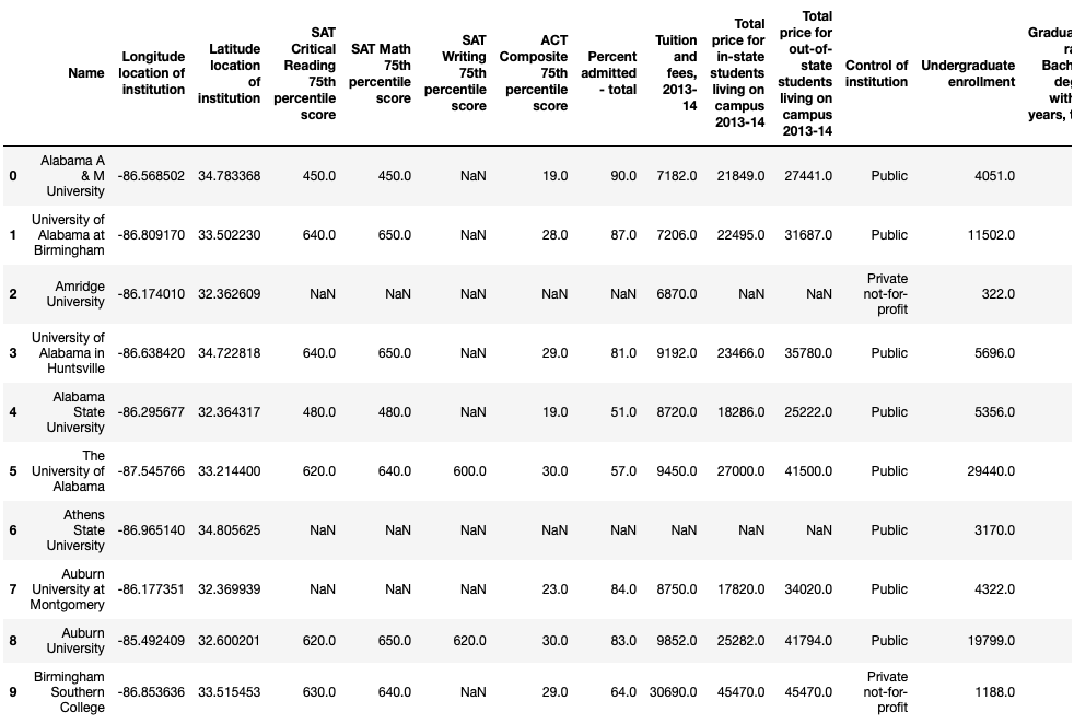 First ten records of the dataset
Our dimensions printout shows us that we have 1534 universities in our dataset, with 15 different features for each school.
education.shape
 Dataset dimensions
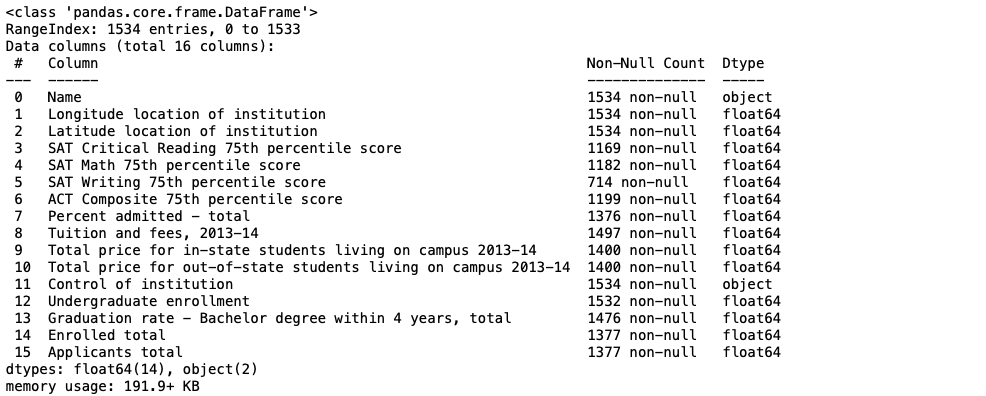
The info() printout shows us the data types of each features, as well as a count of non-null values in each column.
We see that most of our features contain floats, while two of them contain strings. We can also see that all but 4 features contain missing values, as they have a non-null count less than our row total of 1534.
education.info()
 Data types
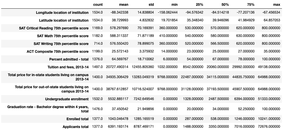
Our describe() printout indicates shows us summary statistics of all our numeric columns.
We can see that our 75th percentile of undergraduate enrollment is 6394, while our maximum enrollment is 51,333. This means we may have several outliers at the top end of this distribution, and that we have more smaller schools in our dataset than larger ones.
Values of zero are present in columns such as undergraduate enrollment, graduation rate, enrolled total, and total applicants. These seem erroneous – it may be reasonable to remove universities with these values from our dataset.
education.describe().T
 Summary statistics
Data Cleaning
Check for Missing Values
From above we can see that our dataframe contains a significant amount of missing values across multiple columns. Because we do not want to lose too much of our data, we decided clean our data over the columns pertaining to our clustering. Running the following code returns the total number of missing values of the columns pertaining to SAT scores.
education.iloc[:,3:6].isnull().sum()
 Missing values
Remove Missing Values
Now we intend to remove the rows that contain missing values over the columns pertaining to SAT scores. To do so, we ran .dropna() on our education dataframe, specifiying to columns with the subset parameter.
education = education.dropna(axis=0, subset=["SAT Critical Reading 75th percentile score",
                             "SAT Math 75th percentile score", "SAT Writing 75th percentile score"]).copy()
This leaves us with a 705 by 16 dataframe indicated below.
education.shape
 Dataset dimensions
Adaptation
In the next section, we wanted to develop some plots built off of the university’s total SAT score benchmark. To do so, we first had to create a Total SAT Score column which is the total of the 3 SAT components.
education['Total SAT Score'] = education.iloc[:,3] + education.iloc[:,4] + education.iloc[:,5]
Additionally, we wanted to develop some plots built off ot the university’s total graduating students . To find this figure, we built a Total Graduating Students column off of the Undergraduate enrollment and Graduation rate - Bachelor degree within 4 years, total columns.
education['Total Graduating Students'] = ((education['Graduation rate - Bachelor degree within 4 years, total'])/100) * education['Undergraduate enrollment']
Using .columns we can verify that the new column was made under our data frame.
education.columns
 Column names
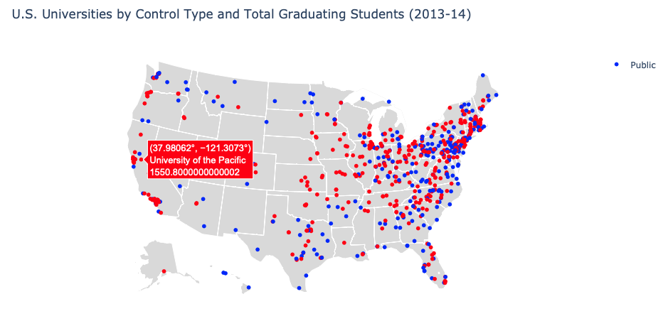
Descriptive Visualization
# Create a new data frame with the necessary columns for our map plot
map_vis = education[['Name', 'Longitude location of institution', 'Latitude location of institution',
                    'Total Graduating Students', 'Control of institution']].copy()

# Make a new 'Control of institution' column for color mapping
map_vis['Public or Private'] = map_vis['Control of institution']

# Create color map dictionary -- blue for public, red for private
pub_priv = {'Public': '#0000FF', 'Private not-for-profit': '#FF0000'}

# Map color values on our newly created column
map_vis['Public or Private'] = map_vis['Public or Private'].map(pub_priv)

def map():
    fig = go.Figure()

    fig.add_trace(go.Scattergeo(
        locationmode = 'USA-states',
        lon = map_vis['Longitude location of institution'],
        lat = map_vis['Latitude location of institution'], marker = dict(color = map_vis['Public or Private']),
        hovertext = map_vis['Name'] + '<br>' + map_vis['Total Graduating Students'].astype(str), name = 'Public'))

    fig.update_layout( title_text = 'U.S. Universities by Control Type and Total Graduating Students (2013-14)',
                      showlegend = True, geo = dict(scope = 'usa', projection_type = 'albers usa',
                                                    landcolor = 'rgb(217, 217, 217)'))
    fig.show()

map()
 Map plot
3D Scatter Plot
For our second visualization, we wanted to create a 3D scatterplot where each point represents the SAT scores 75th percentile for each university. Using the plotly library, we created an interactive scatterplot that enables users to hover over each point to view the SAT components for each school.
def scatter3D():
    fig = go.Figure(data=[go.Scatter3d(x=education["SAT Critical Reading 75th percentile score"],
                                       y=education["SAT Math 75th percentile score"],
                                       z=education["SAT Writing 75th percentile score"], mode='markers',
                                       text=education["Name"])])

    fig.update_layout(title='U.S. Universities by SAT Component Scores, 2013-14', title_font_size=25,
                      scene = dict(xaxis_title="SAT Critical Reading Score", yaxis_title="SAT Math Score",
                                   zaxis_title="SAT Writing Score"), width=1000)
    fig.show()

scatter3D()
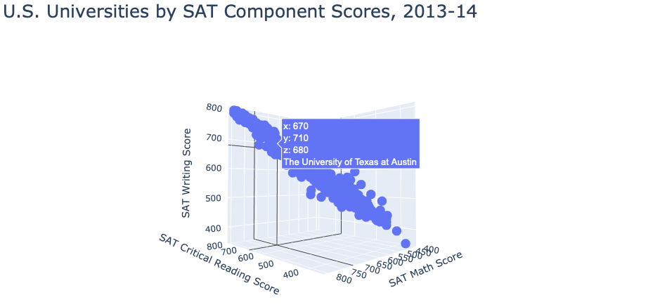 Scatter plot
Pie Chart
We wanted to make sure we have a fair distribution of data from both controls. Using a pie chart on our education dataset, we can see that 64.0% of our data comes from private universities, while 36.0% comes from public universities.
data = {"Control of Institution":list(education["Control of institution"].value_counts().index),
       "Count":list(education["Control of institution"].value_counts())}
df = pd.DataFrame(data)

def pie():
    fig = plt.figure(figsize =(10, 10))

    control = df["Control of Institution"]
    count = df["Count"]
    colors = ("#2471A3","#7FB3D5")

    plt.pie(count, labels=control, autopct='%1.1f%%', shadow=True, startangle=240, colors=colors)
    plt.axis('equal')
    plt.title('U.S. Universities by Control Type, 2013-14', fontdict = {'fontsize': 25})
    plt.show()

pie()
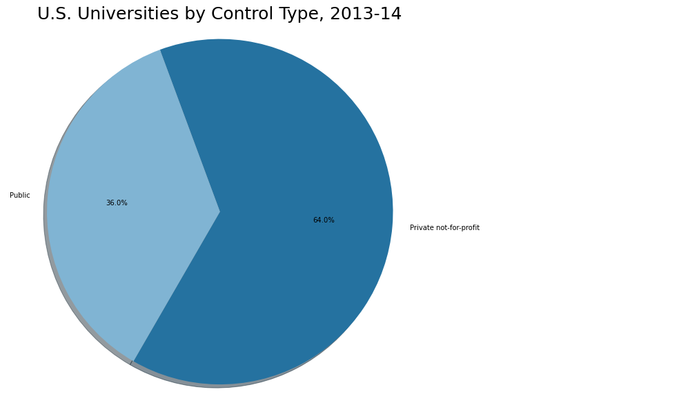 Pie chart
Violin Plot
Using the education dataset one more time, we created a violin plot that displays the distibution of the total SAT score benchmark for both public and private universities. Our plot also enables users to hover over the data points and retrieve the tuition data for each university.
def violin():
    fig = go.Figure()

    control = list(education["Control of institution"].value_counts().index)

    df = px.data.tips()
    fig = px.violin(education, y="Total SAT Score", x="Control of institution", color="Control of institution",
                    box=True, points="all",hover_data=education.iloc[:,[0,16]])
    fig.show()
violin()
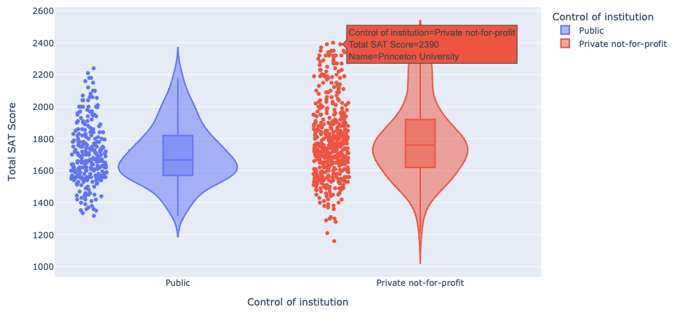 Violin plot
Step-by-Step Hierarchical Clustering
For the first step in our cluster analysis, we will perform hierarchical clustering on our dataset, so that we may determine an appropriate number of clusters to use going forward. We will do this manually first, before we use the linkage() function from scipy to do it automatically. To begin, we need to create a distance matrix for all the points in our dataset. We’ll also need to define some functions to make each iteration a little simpler in terms of code. We’ll do this below – please see the comments for details on implementation.
# Create distance matrix using 'euclidean_distances' function
education_distance = DataFrame(euclidean_distances(education[['SAT Critical Reading 75th percentile score',
                                                              'SAT Math 75th percentile score',
                                                              'SAT Writing 75th percentile score']]))
# Set entries to floats, to allow for NaN masking
education_distance = education_distance.astype('float')
# Replace zeroes in diagonals with NaN -- makes finding minimums easier (avoids nested for loop)
np.fill_diagonal(education_distance.values, np.NaN)


# Function to obtain row and column indices of first occurrence of value in dataframe (takes dataframe and numeric entry value)
def get_index(frame, value):
    # Initialize empty list to return
    indices = []
    # Create Boolean dataframe ('true' where value exists)
    bool_frame = frame.isin([value])
    # Return series of Booleans with column indices ('true' if value exists in column)
    col_list = bool_frame.any()
    # Grab column indices where value exists
    col_inds = list(col_list[col_list == True].index)
    # Iterate over columns
    for col in col_inds:
        # For each column, obtain Boolean series with row indices ('true' where value exists)
        rows = list(bool_frame[col][bool_frame[col] == True].index)
        # Iterate over rows
        for row in rows:
            # For each row, append row and columns indices to list (value exists on these indices)
            indices.append((row,col))
    return indices

# Function to obtain distances to each point when obtaining new clusters (to append to distance matrix)
def get_cluster(c1, c2):
    # Intitalize empty list to return
    cl_distances = []
    # Iterate over matrix columns
    for col in education_distance:
        # Ignore columns of the two points that are clustering
        if (col == c1) or (col == c2):
            continue
        # Define the two column entries corresponding to the row indices of the points being clustered
        val1 = education_distance.loc[col][c1]
        val2 = education_distance.loc[col][c2]
        # Append the minimum distance to list
        cl_distances.append(np.min([val1,val2]))
    return cl_distances

# Define integer that increases with each iteration, used to define new clusters in matrix
clust_iter = education_distance.shape[0]

# Intialize empty linkage matrix
link_mat = []

# Initialize empty dictionary, and add value of 1 for each point
# This will be used to keep track of the amount of original data points in each new cluster
clust_dict = {}
for i in range(education_distance.shape[0]):
    clust_dict[i] = 1
Now that we have our functions, and all necessary objects have been created, we can begin our iterative process for hierarchical clustering. The basic idea involves finding the two points in our dataset that are closest together, clustering them, and redefining the distances between the new cluster and all other points. This process repeats until we have one large cluster that contains our entire dataset.
This process is outlined below, and will ultimately produce a linkage matrix which we can use to plot a dendrogram. Once again, please see the comments below for details on implementation.
while education_distance.shape[0] > 1:
    # Define minimum value over the entire matrix
    min_dist = min(education_distance.min())

    # Get row and column indices where first occurrence of minimum value exists
    clust_inds = get_index(education_distance, np.nanmin(min_dist))[0]

    # Obtain list of distance values to be appended as new cluster
    new_cluster = get_cluster(clust_inds[0],clust_inds[1])

    # Drop rows and columns of points being clustered
    education_distance = education_distance.drop([clust_inds[0],clust_inds[1]]).drop([clust_inds[0],clust_inds[1]],axis=1)

    # Add new distances as a column in matrix
    education_distance[clust_iter] = np.array(new_cluster)

    # Append NaN to new distances list, and add as a row in matrix
    # Ensures symmetry in new matrix, with NaNs down the diagonal
    new_cluster.append(np.NaN)
    education_distance.loc[clust_iter] = np.array(new_cluster)

    # Add new entry to dictionary for new cluster -- value is the sum the points in the two original clusters
    clust_dict[clust_iter] = clust_dict[clust_inds[0]] + clust_dict[clust_inds[1]]

    # Create list of indices of points being clustered, the distance between them, and the sum of original points in new cluster
    link = [clust_inds[0], clust_inds[1], np.nanmin(min_dist), clust_dict[clust_iter]]

    # Append this to linkage matrix and advance numeric iterator forward (for next cluster)
    link_mat.append(link)
    clust_iter += 1

    # Ensure all column names are integers (new column name is a string by default)
    education_distance.columns = education_distance.columns.astype(int)

# When finished, converge linkage matrix to an array (to be used with dendrogram() function)
link_mat = np.asarray(link_mat)

np.set_printoptions(suppress=True)
link_mat
 Linkage matrix
Our above linkage matrix printout details the order in which our points were clustered, along with the minimum distance in each iteration, as well as the total number of original points in each new cluster. We can see that our last entry in the matrix is 705, indicating that the last cluster (that includes the entire dataset) includes 705 points – we know this is correct since this is indeed the size of our dataset.
Because we decided we wanted to cluster universities based on SAT Math, Reading, and Writing scores, we created a subset called SAT that contains the columns pertaining to these scores. In addition, we set the index to the Name of the universities.
SAT = education.iloc[:,[0,3,4,5]].copy()
SAT = SAT.set_index("Name")
Our next step is to plot a dendrogram using the linkage matrix we created. We can do this like so:
figure(figsize=(15, 500))
D = dendrogram(link_mat, orientation="right", leaf_font_size=15, labels = SAT.index)
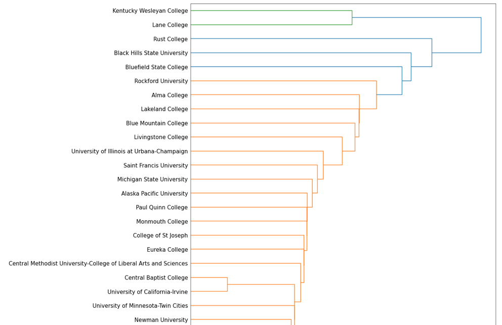 Dendrogram (partial)
Based on the above color scheme of our dendrogram, $k=3$, which represents the number of clusters we should use throughout our analysis. However, we can see that some of the determined clusters might be questionable, as the green cluster at the top of our printout only includes two schools, and the blue cluster next to it only includes three. Since this was implemented manually, our process may be missing some more subtle details, and may not be as accurate as the linkage() function. Furthermore, this implementation used the “single linkage” method to determine our clusters – it may be more reasonable to use the “average” or “complete” linkage method to achieve the clusters we want.
Before moving onto the next step, let’s compare this result to a dendrogram created using the linkage() function.
Dendrogram using linkage
figure(figsize=(15, 500))
D = dendrogram(link_mat, orientation="right", leaf_font_size=15, labels = SAT.index)
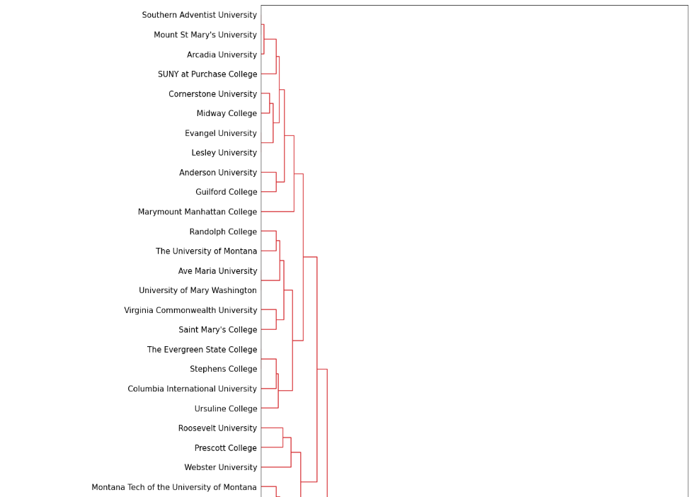 Dendrogram (partial)
Step-by-step K-means
Random Centroids
Now that we know $k = 3$, we wanted to establish 3 random centroids. To begin, we made a copy of our SAT dataframe.
step = SAT.copy()
Next, we established 3 random centroids.
step.loc['Centroid 1'] = [750, 750, 750]
step.loc['Centroid 2'] = [450, 450, 450]
step.loc['Centroid 3'] = [600, 550, 600]
To make it easier to identify our centroids in our plot, we wanted to designate a different color for each. The following code specifies that 705 of our original data points will be grey while our 3 centroids will each be a different color.
c = np.concatenate((np.repeat("grey", 705), np.array(["fuchsia","navy","yellow"])))
Plotting the data of our new copy into a 3D scatter plot, we can now see where each of our centroids lie.
def random():
    fig = go.Figure(data=[go.Scatter3d(x=step["SAT Critical Reading 75th percentile score"],
                        y=step["SAT Math 75th percentile score"], z=step["SAT Writing 75th percentile score"],
                        mode='markers', marker=dict(color=c, size=np.concatenate((np.repeat(17,705),
                        np.array([35,35,35])))), text=step.index)])

    fig.update_layout(scene = dict(xaxis_title="SAT Critical Reading Score", yaxis_title="SAT Math Score",
                                   zaxis_title="SAT Writing Score"), width=1000, margin=dict(r=30, b=10, l=10, t=10))
    fig.show()

random()
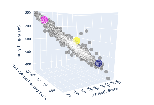 3D scatter plot
Clustering Algorithm
To cluster our universities, we created a function called kmeans() that takes in a dataframe df and k, number of means, as parameters and returns the clusters created. Our function actually creates clusters manually without the support of any external libraries.
def kmeans(df,k):
    test = df.copy()

    for i in range(1,k+1):
        test.loc['Centroid '+str(i)] =  np.random.randint(0,801,3)

    test["Association"] = ""

    j = 1

    while j < 50:
        for i in range(1,k+1):
            test[str(i)] = np.sqrt((test.iloc[:,0] - test.loc['Centroid '+str(i)][0])**2
                                   + (test.iloc[:,1] - test.loc['Centroid '+str(i)][1])**2
                                   + (test.iloc[:,2] - test.loc['Centroid '+str(i)][2])**2)

        test["Association"] = pd.to_numeric(test.iloc[:,4:].idxmin(axis = 1))

        for i in range(1,k+1):
            test.loc['Centroid '+str(i)] = test[test.Association == i].iloc[0:39,0:3].mean()

        for i in range(1, k+1):
            test.loc['Centroid '+str(i)]["Association"] = i

        j = j + 1

    fig = go.Figure(data=[go.Scatter3d(x=test.iloc[:,0], y=test.iloc[:,1], z=test.iloc[:,2], mode='markers',
                          marker=dict(color=test["Association"], size=np.concatenate((np.repeat(17,705),
                          np.repeat(35,k)))), text=test.index)])

    fig.update_layout(scene = dict(
        xaxis_title="SAT Critical Reading Score",
        yaxis_title="SAT Math Score",
        zaxis_title="SAT Writing Score"),
                      width=1000,
                      margin=dict(r=30, b=10, l=10, t=10))
    fig.show()
Running the function on our SAT dataframe and specifying $k = 3$ returns the following clusters.
kmeans(SAT,3)
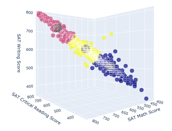 3D scatter plot
sklearn.cluster
In this next section, we wanted to run another unsupervised k-means cluster, but this time using the sklearn.cluster library. With the function KMeans(), we specified that we want the data of our model to be divided into 3 clusters. Running the .fit() method on our SAT dataframe indicates the creation of the clusters.
# K Means Cluster
model = KMeans(n_clusters = 3)
model.fit(SAT)
Plotting Clusters with k = 3
Now we were able to plot our clusters by defining the color of our points to be equal to model.labels_, an array of the associated clusters.
def k_means_cluster():
    fig = go.Figure(data=[go.Scatter3d(x=SAT.iloc[:,0], y=SAT.iloc[:,1], z=SAT.iloc[:,2], mode='markers',
                                   marker=dict(color=model.labels_), text=SAT.index)])

    fig.update_layout(scene = dict( xaxis_title="SAT Critical Reading Score", yaxis_title="SAT Math Score",
                                   zaxis_title="SAT Writing Score"), width=1000, margin=dict(r=30, b=10, l=10, t=10))
    fig.show()

k_means_cluster()
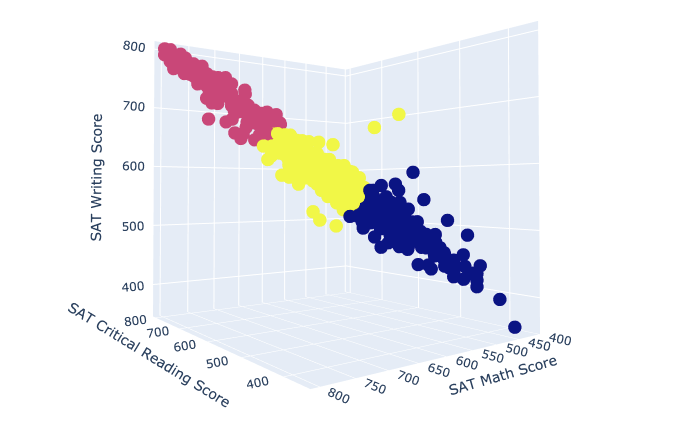 3D scatter plot
kNN Function:
Lastly, we wanted to create a function called predictKNN that takes in 3 parameters: k number of neighbors, a vector, and a dataframe df. Running the function returns the classification of the vector specified.
def predictKNN(k, vector, df):
    knn = KNeighborsClassifier(n_neighbors = k, p = 2)
    knn.fit(df, model.labels_)

    cluster = knn.predict(np.array(vector).reshape(1, -1))[0]
    color = ["Blue", "Pink", "Yellow"]
    print('SAT Reading Score:', vector[0], '\nSAT Math Score:', vector[1], '\nSAT Writing Score:', vector[2],
          '\nPrediction: Cluster #', cluster, color[cluster])
The following are 5 different iterations verifying the accuracy of our function.
predictKNN(5, [500,550,500], SAT)
 Prediction 1
predictKNN(5, [400,400,400], SAT)
 Prediction 2
predictKNN(5, [750,750,750], SAT)
 Prediction 3
predictKNN(5, [600,600,600], SAT)
 Prediction 4
predictKNN(5, [400,700,800], SAT)
 Prediction 5
Conclusion
When assisting high school seniors during their college application process, the San Francisco County Office of Education might want to have a better understanding of the accepted SAT component scores across all U.S. universities so that they can give more in-depth recommendations of schools for their students to apply to. In our study, we used cluster analysis to provide this understanding. With the use of hierarchical clustering, K-means and K-Nearest Neighbors, we grouped universities based on similarities in their accepted SAT component scores. In addition, we built a recommendation engine that can return the classification of any data point. This provides tremendous support when assisting students in their college application process because the clusters can help them determine which schools they will most likely get accepted to by providing their own SAT scores and seeing which cluster they lie in.
Presentation Slides
The source code is available here.


